
CATEGORY
Design Inspiration
WRITER
Chukster
ARTICLE
Nice Things: May Edit
DATE
26.05.26
Every month we publish a short list of work we've been thinking about. This months theme is scope discipline as strategy: knowing exactly what your thing is, and not diluting it.
1. Doggo Paracord
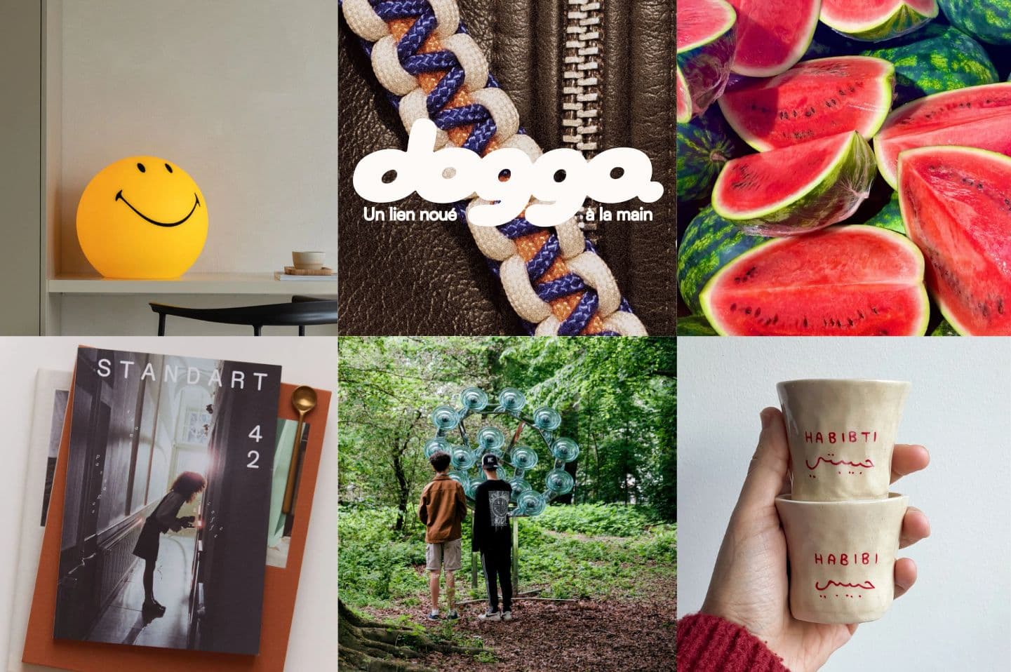
A small creator in Paris who loves her dog so much she started making her own leashes. This is a perfect example of why story and bold branding beats anything a big business with millions in marketing budget could produce. The direct, personal story, the dog that started it all. We'll be keeping a close eye on her next moves.
2. Mr Maria Smiley Lamp
As visual designers, we're fairly nerdy when it comes to semiotics. The yellow smiley face is probably one of the five most recognisable icons in the world, which makes it a pretty risky design proposition. Mr Maria's version is a case study in how to take something so familiar it risks becoming invisible, and make it feel desirable again. When the symbolism is already iconic, it comes down entirely to materiality and detail. This one gets both right.
3. Yamine Ceramics
Scope discipline works particularly well for small creators, and Yamine Ceramics is another clear example: one word in Arabic script on a handmade cup. Yamine isn't illustrating cultural identity, she's encoding it directly into the object at the level of material and language. No secondary narrative required. The object explains itself.
3. Standart Magazine
We spend a fair amount of time building social media strategies, and one consistent finding is that going niche pays off. So it shouldn't surprise anyone that print is seeing the same pattern. Standart Magazine is a great example of avoiding scope creep and keeping it simple: just coffee. Plus a genuinely beautiful layout.
5. Bloom Festival
Festivals are where narrow propositions go to die. The financial logic almost always pushes toward broadening: add a music programme, bring in a beverage partner. Bloom has managed to add that at scale, while staying true to its niche topic. Here, Nature is always the subject, not a backdrop for other programming, and the editorial identity holds across a pretty complex multi-day event. It's impressive and we will definitely be attending!
6. Watermelons
The control group. Visually iconic, structurally satisfying, universally understood, and it got there without a brand strategy. It's also watermelon season, and we felt that deserved acknowledgment.
If there's a through-line this month, it's that the most clear and simply designed things rarely need to explain themselves. The subject-focused magazine does it. The leash does it. The watermelon definitely does it. See you next month. 🍉
MORE ARTICLES
How I turned an Article into an Internship
Design Inspiration

Nice Things: March Edit
Design Inspiration
Nice Things: June Edit
Design Inspiration