
CATEGORY
Creative Insights
WRITER
Rebecca M
ARTICLE
Sézane's Rebrand: It's kinda chic. Or is it?
DATE
08.09.26
Sézane ditched the house in the country and moved to the city
Figuratively speaking that is. Practically they were probably always based in Paris. Or not. I have no idea. I should probably google that.
A few years ago, I wrote an article about the rebrand of monki - the Swedish fashion brand that came of age with the first wave of online fashion bloggers, and had a firm place in the heart of experimental, self-expressing millennials. Until the rebrand, which made said millennials feel old - and somehow didn’t land with the younger audience monki arguably tried to score, either.
You can read the full story here: https://chukster.com/blog/did-monkis-2023-rebrand-y2k-fly-too-close-to-the-sun/
So when I read that French Fashion brand Sézane, known for classy, well tailored shirts, patterned dresses and beautiful knitwear, had gone through a rebrand and the internet wasn’t happy about it - I had no choice but to start digging.
The Story of Sézane
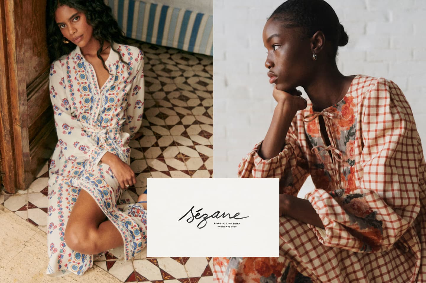
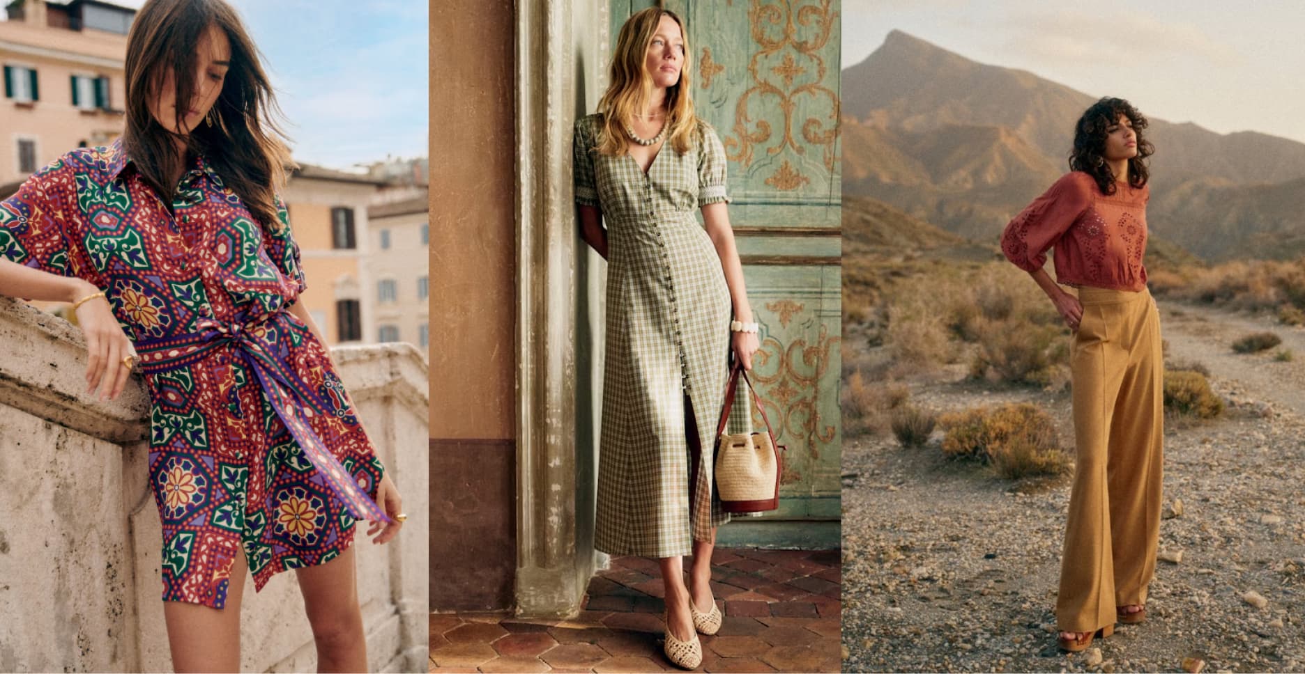
Sézane has always exuded something quintessentially French. Effortless dressing, a sort of put-together that looks chic and expensive, and like you hadn’t tried. With collections in colours like plum, rosemary or dark caramel (not their actual colour names, just how I would describe them), and delicate patterns.
I would look at their clothes in their lookbooks, casually thrown across a farmhouse style wooden chair, and picture a fabulous Parisian in her country house in La Baule, messy bun but perfectly fitted shirt, leather slip-ons soft from years of wear, making a tarte aux pommes from scratch. Light dusting of flour in her hair and cheeks light pink from the heat of the oven. Probably an AGA.
A brand is nothing without its people
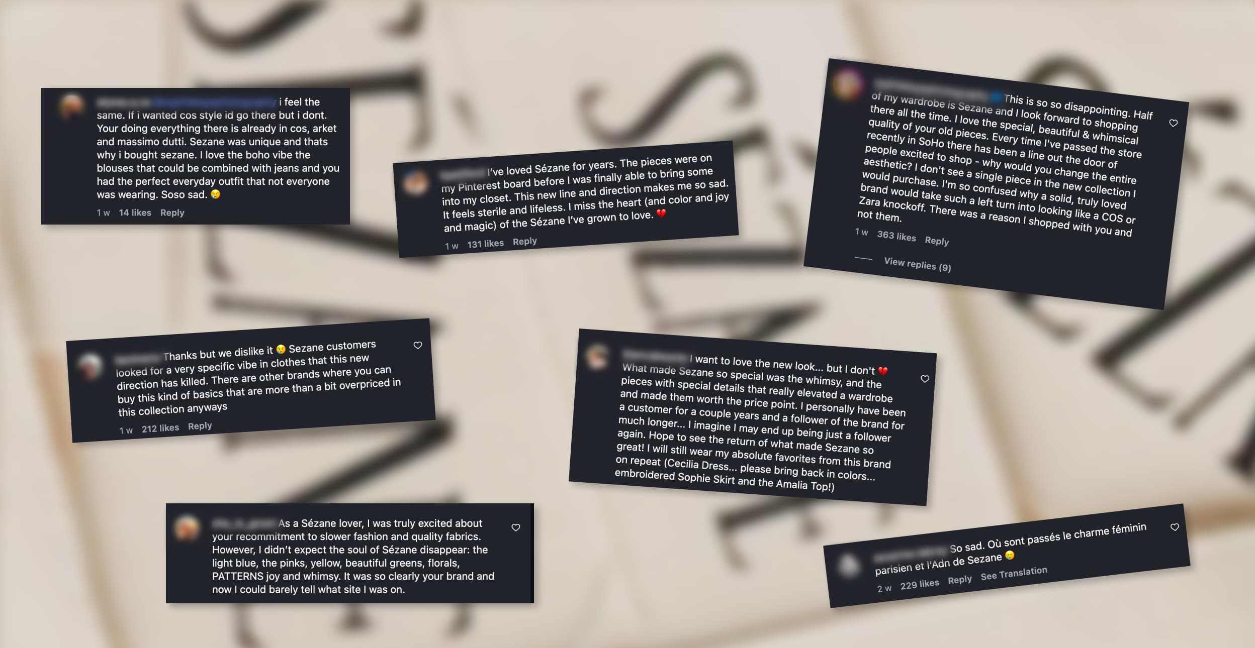
Sézane went through a re-brand and the internet is not happy. The brand is compared to Zara, COS, Arket. They've lost their soul - I read. And "where is the whimsy? where is the joy?", and "I will not shop here anymore". Many times over.
The audience was not simply buying Sézane. Owning a soft, patterned dress or knitwear with ornate buttons and delicate embroidery conjured up a whole world. From the silk paper wrapped around the product to an image of a warm summer evening, walking across worn tiles to go to an al fresco dinner.
Some interesting parallels to the monki rebrand come to mind. A customer base feeling like a brand leaning into colour, patterns and softness has all of a sudden abandoned them.
A brand is more than a visual identity, or a collection of products - and a brand is nothing without its people. A brand is a cultural convention, a belief in a shared universe that creates a sense of belonging and identity.
Branding creates strong emotions. And as it seems, a real feeling of loss when a brand you love...changes.
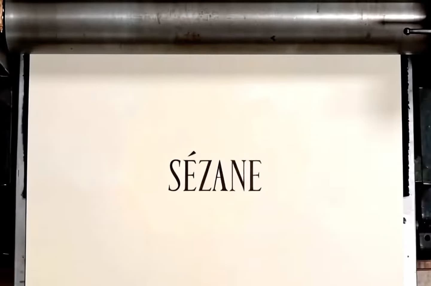
A new look - and more importantly, new attitude
So what changed? At first glance, not all that much.
Their logo had changed a few times over the years, always spaced out, set elegantly against a cream coloured background. The brand was minimalist, soft, feminine, dreamy. Whimsical.
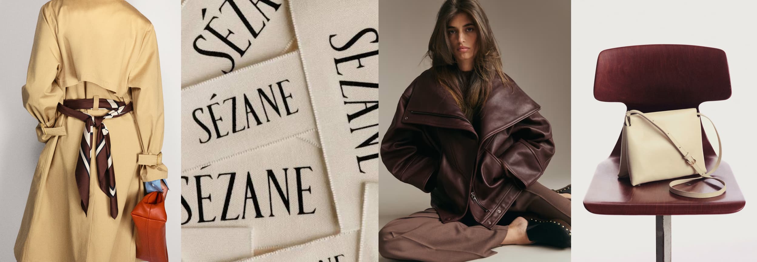
The nw logo uses a more condensed, more assertive serif font. The space between the letter has disappeared.
That space however appears in the art direction - near empty frames with a model just peaking in from the side, as if on a rush with no time to pose.
Here we are not building worlds, we are building the character - the persona.
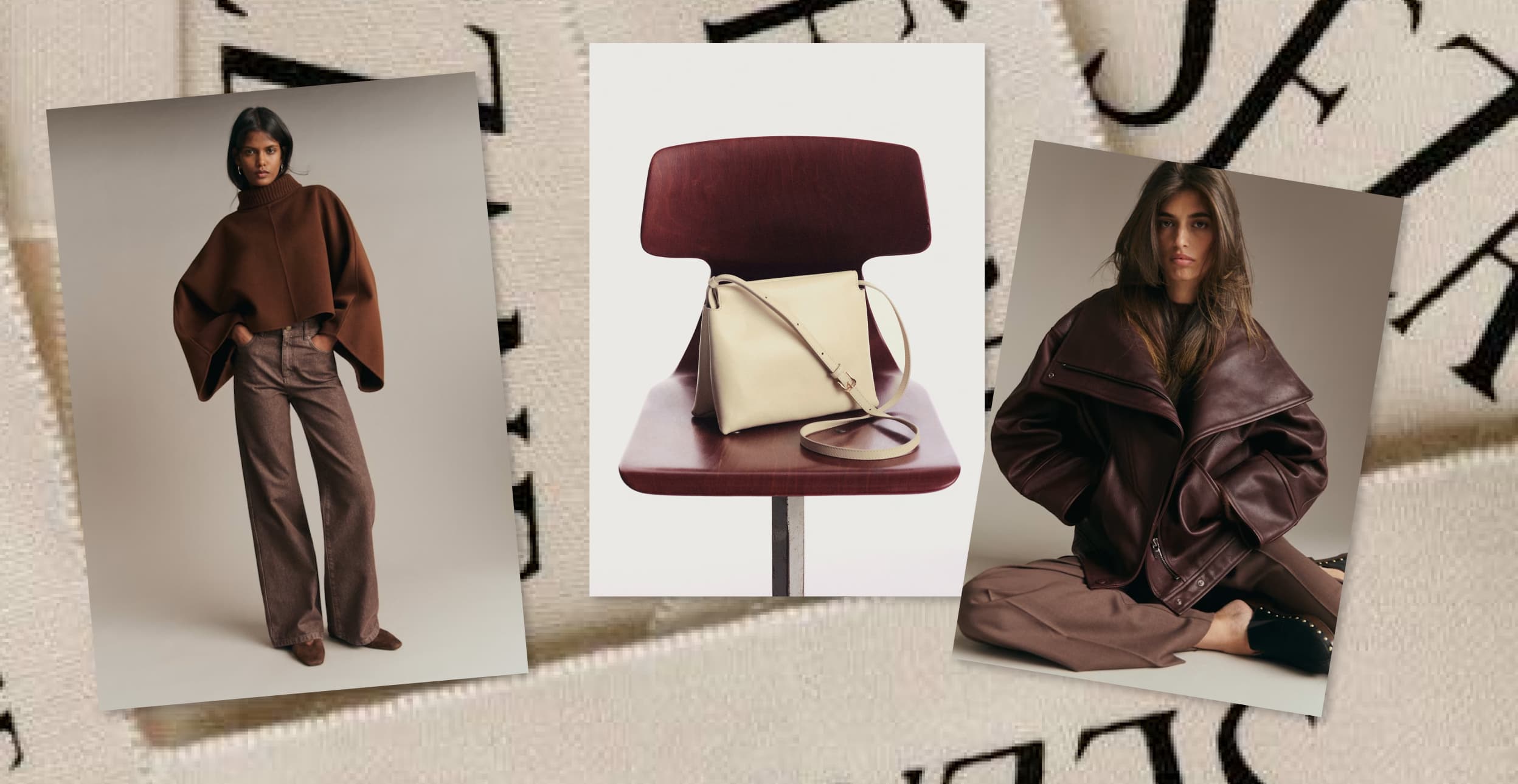
Product photography is structural, a leather bag draped on a designer chrome chair, centered, almost like a piece of art. Definitely no worn-in slippers or flour dust anywhere.
The models look less whimsy and more badass, ready to fight for their right - to another café au lait, or another hour reading (something intellectual) in the spring sun.
The website shows hand drawn process footage of their new logo and patterns. This is leaning into tradition, craft and the tailoring profession. Sharp pencils, wax paper, forms fine-tuned with time and care.
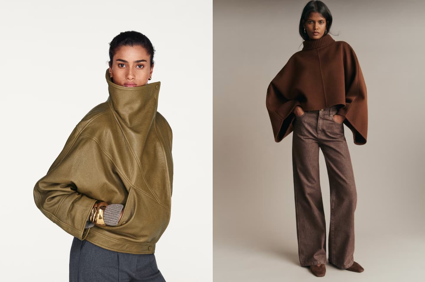
The first collection under the new brand includes leather jackets, trench coats, handbags. So far so Sézane. But the colours are more moody, deep, intense. The art direction exudes defiance. The “come eat cake with me” has firmly been replaced with a cool girl aesthetic. Gone are the soft, dreamy and feminine. This is all about sculptural, moody and assertive.
So what do we make of it all?
Maybe the negative feedback, the upset and the pushback are not too dissimilar to the monki case. An existing clientele feels like they are being short changed, pushed to the fringes and replaced with a younger, cooler, more confident crowd. A crowd that doesn’t ask but take.
However, this rebrand is much more in line with the Sézane heritage than monki’s ever was. The shift, while clearly noticeable, feels smooth. The colour palette shift is subtle, the logo type is still an elegant serif albeit more condensed. This feels more like an evolution than a complete character shift.
Personally - I love it. All of it. I’ve always liked sezanes tailoring and muted colour palettes but felt that their clothes weren’t really for me. I never fully identified with what I perceived to be a successful but somewhat elusive audience. Well paid corporate job, house in the countryside, 2 kids, happy husband. Picture book Parisian romance.
Give me Paris’ multiculturalism, vibrant streets, grumpy waiters and glamorous people in a hurry any day.
Right, I’m off to remortgage my house for one of their leather jackets.
I don’t own a house.
All images from www.sezane.com and Google Images.
MORE ARTICLES
Designing with Purpose
Creative Insights
Silk Purses and Sow's Ears: Our Design Philosophy
Creative Insights
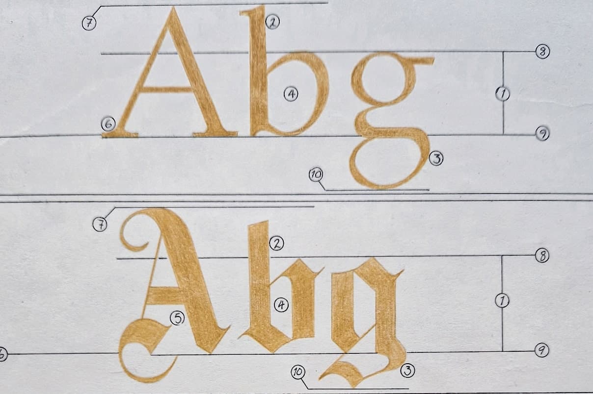
Typography - not just a pretty face :)
Creative Insights