CATEGORY
Creative Insights
WRITER
Steven
ARTICLE
Typography - not just a pretty face :)
DATE
28.02.23
TYPOGRAPHY - NOT JUST A PRETTY FACE 🤓
Typography is an essential aspect of graphic design. It is the art of arranging type to make written language legible, readable, and appealing. It involves choosing typefaces, point sizes, line lengths, line-spacing (leading), and letter-spacing (tracking and kerning), among other elements. Good typography can enhance the visual appeal and readability of a design, whilst poor typography can detract from it.
My first experience of typography was as a student at - what could only be described as - an "old-school" art-school in the small UK town of Loughborough where we studied traditional typography in great depth. Some projects involved hand-drawing paragraphs of text in tiny 6/7.5pt (6-point letter size on 7.5-point leading) Times Roman (you really needed a sharp pencil and 20/20 vision!).
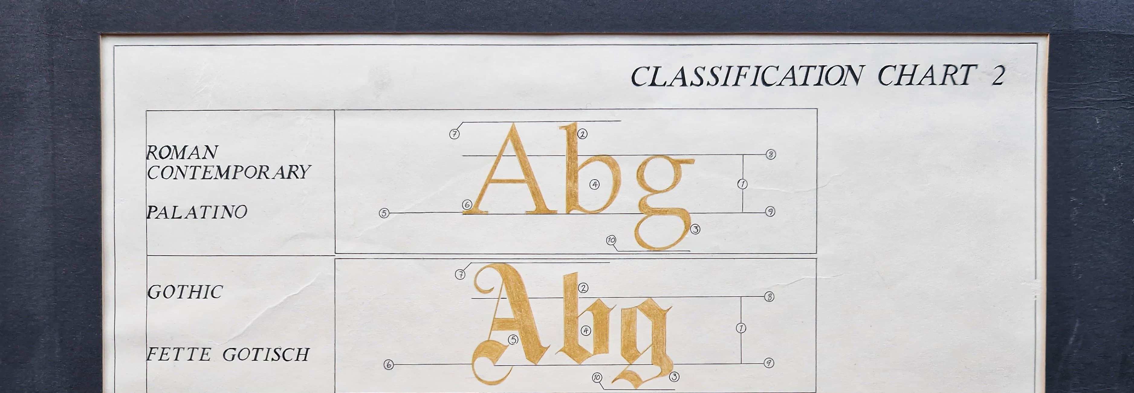
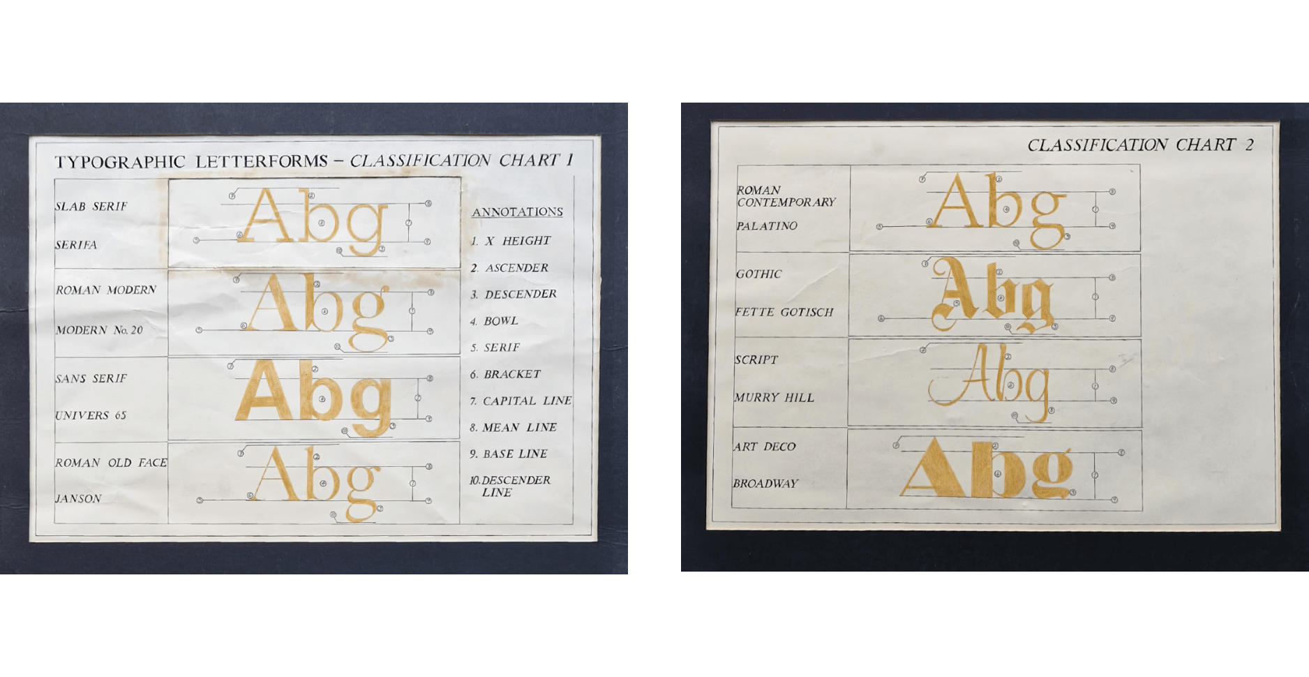
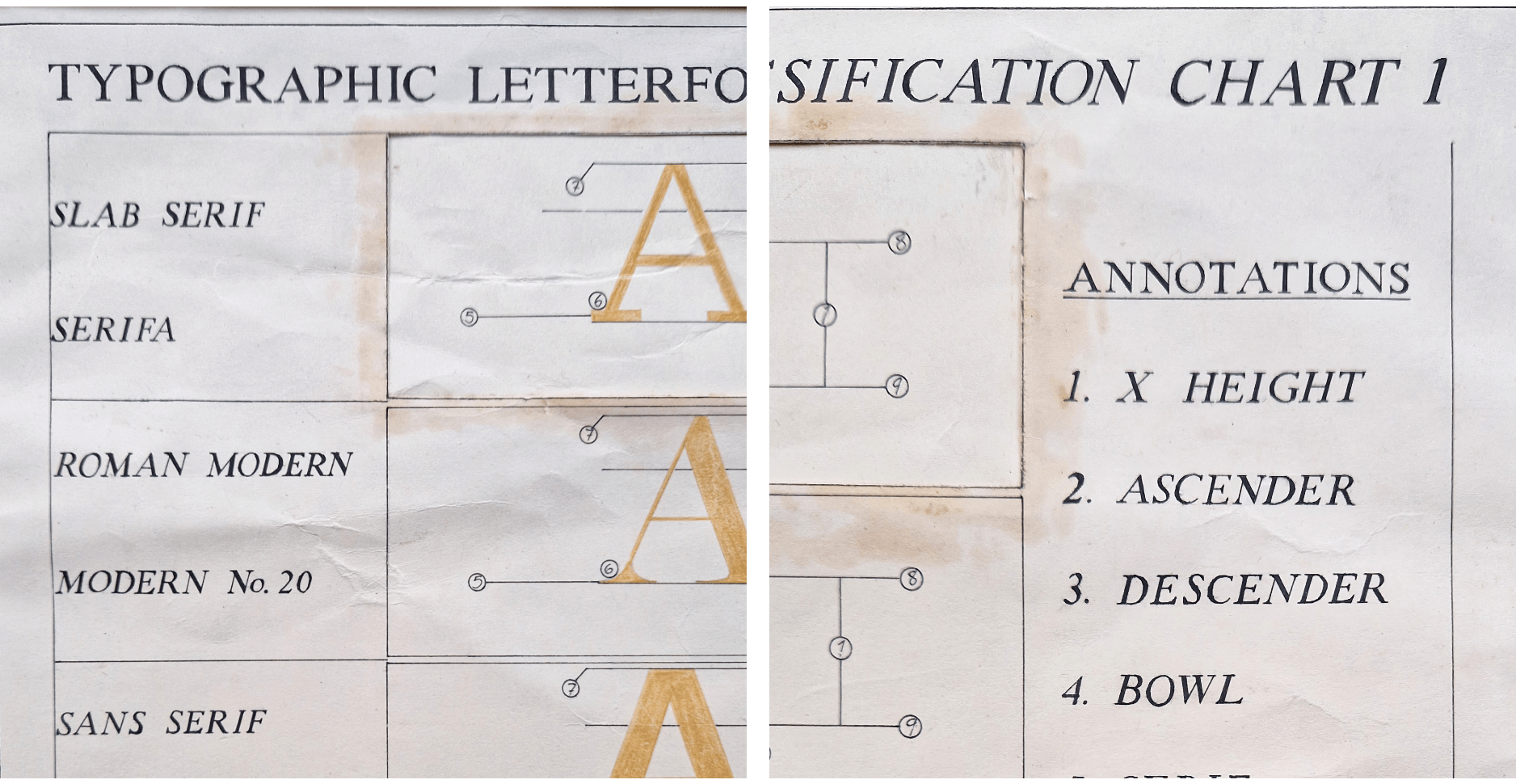
In other projects we hand-drew and analysed different letterforms and their component parts, such as the baseline, ascender, descender, x-height, and serifs (see accompanying examples of my work).
We discovered how each of these elements help define the character of a typeface and play a significant role in determining its overall appearance and legibility.
Initially, hand-drawing lettering like this seemed a tedious task, but I soon began to appreciation it for the discipline it taught me, and my love for typography as an art form to this day. If you’d like to know more about the technical aspects of letterforms, the following should help:
Typographic Terminology
1. X-height:
The x-height refers to the distance between the baseline and the top of the lowercase letters, excluding the ascenders and descenders. It is a crucial aspect of type design and affects the legibility and readability of a typeface.
2. Ascender:
The ascender is the part of a lowercase letter that extends above the x-height. Letters such as "b," "d," "f," and "h" have ascenders.
3. Descender:
The descender is the part of a lowercase letter that extends below the baseline. Letters such as "g," "j," "p," and "q" have descenders.
4. Bowl:
The bowl refers to the rounded part of a letter and can be open or closed. Selecting type with certain bowl shapes is particularly important when selecting smaller font sizes. Letters such as “d”, “g” and “b” have bowls.
5. Serif:
Serifs are the small lines or flourishes that extend from the ends of the strokes that make up a letter. They are an essential part of many traditional typefaces and can play a significant role in determining the character of a typeface.
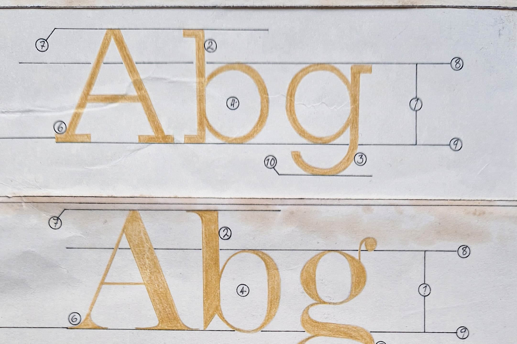
6. Bracket:
Brackets are the curved strokes connecting the serif to the main body of certain letterforms, usually found within a serif font family.
7. Capital Line:
The capital line is the imaginary line which runs across the top of the capital letters in a typeface.
8. Mean Line:
The mean line is the imaginary line which runs across the top of non-ascending lowercase letters. The distance between the baseline and the mean line is known as the x-height. Due to more pleasing optics, rounded glyphs often overshoot this line slightly.
9. Baseline:
The baseline is the imaginary line upon which most letters sit. It helps to align letters and gives a design a harmonious look.
10. Descender Line:
The descender line is the imaginary line that marks the lowest point at which certain letters, such as “q”, “y”, “p” and “j”, descend.
In conclusion, typography is a crucial aspect of good design. By understanding the elements of typography, designers can create designs that not only look visually appealing, but also communicate their message clearly and effectively to their audience or customer.
MORE ARTICLES

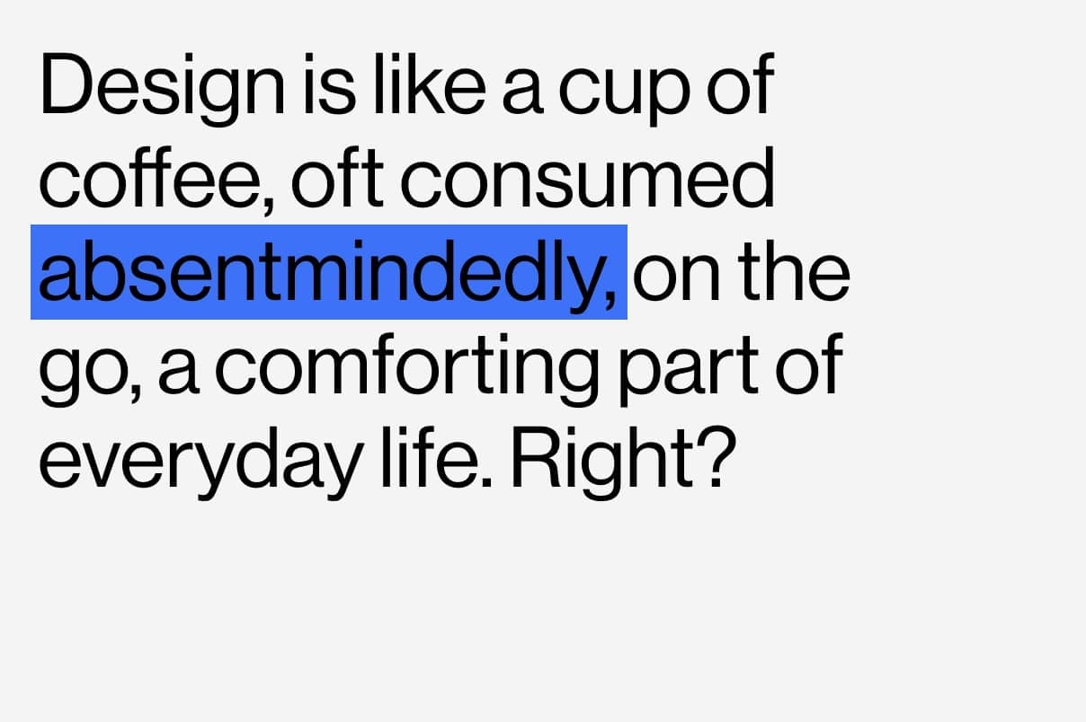
Design is like a cup of coffee
Creative Insights

Design resilience
Creative Insights

Why we do instagram differently
Creative Insights